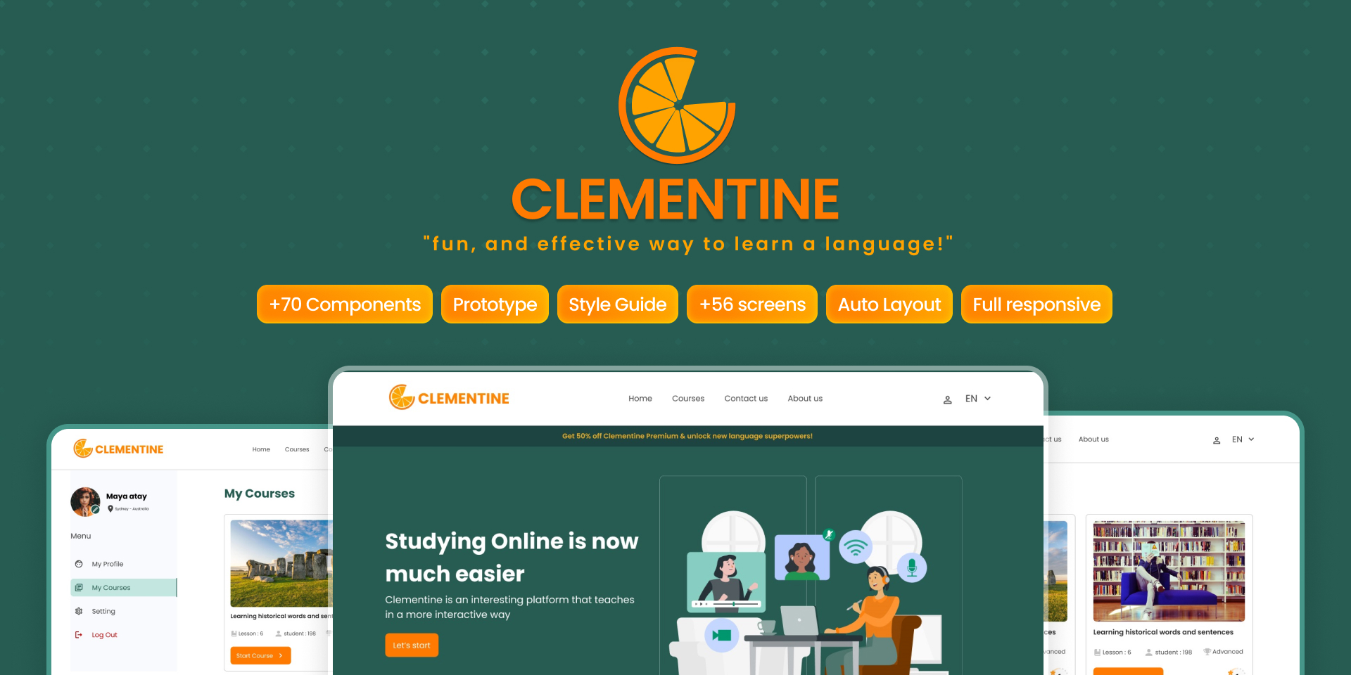
High-fidelity Mockup and prototype of "Clementine" platform
Overview
Clementine is a passion project. As a non-native English speaker community, we understand the importance of engaging with language learning in an enjoyable way, which helps us feel connected to the host country rather than excluded. Language acquisition is crucial for any immigrant’s well-being.
As an avid user of various language learning applications like Duolingo and Elevate, we handpicked the best features from these platforms and tailored them to create something that aligns with busy newcomers lives.
In this language training site, the end user will be able to easily access educational resources online from anywhere. We provide them with engaging and varied training programs that will help improve listening, speaking, reading and writing language skills.
Also, there is a language test on this site. users can evaluate their mastery of the language they want by using various tests and different levels. These tests help them to identify strengths and weaknesses in language skills and work on them.
At Clementine, our mission is to provide a personalized and enriching language learning experience for individuals from diverse backgrounds. We believe that language acquisition should be both effective and enjoyable, fostering a sense of belonging and empowerment. Through innovative features and user-centric design, we aim to support learners in their journey to linguistic proficiency, enabling them to thrive in their new environment.

My Role
As a UX consultant and prototype designer, I have been handed off the presentation of research and some wireframes for some parts of the application that would be accessible for free and users can experience what is it like to get involved with the product.

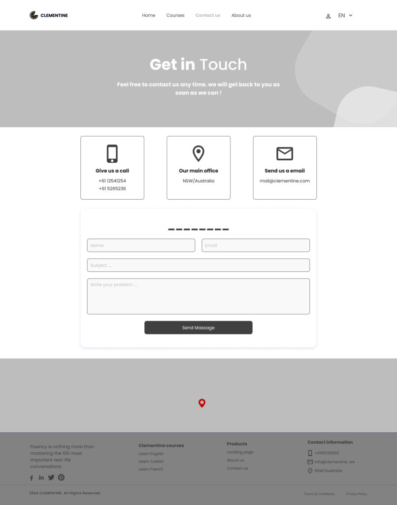
An example of given wireframe
Partial Design and prototyping of Clementine
Style Guide:
- Colors (Primary – Secondary – State – Base – Neutral).
- Typography and Iconography.
- Grid System, Spacing, Padding and Radius.
Components:
Over 70 elements have been made as reusable components and variants.
MockUps:
A static representation of the design for two main screen sizes, Desktop and mobile .
Prototype:
A dynamic representation of the design for two main screen sizes, Desktop and mobile .
Thank you for dedicating your time to review this showcase.
